City Lit - last week of intro to painting
- Nov 24, 2016
- 2 min read

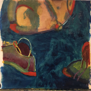

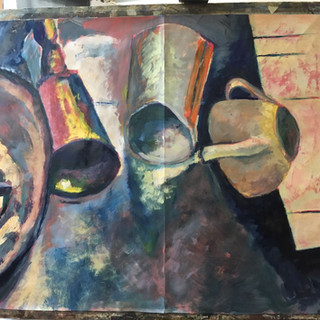
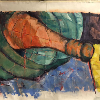


This week we put the finishing touches on our paintings, by introducing a 5th colour . We were sort of on our own with Adam taking us this week. When he eventually got to me he advised me to put a glaze in the right top background to get it more back to the original drawing. And to bring forward the skittle by making some of the drawing lines in it less prominent, again more like the drawing. So I did, but I'm not sure if it's made it rather dull - and highlighted the fact that I didn't try very hard to make the shapes into 3d objects. All-in-all I was pretty confused by the aims of this exercise, I had gone from thinking it was a straight-forward paint a 3d object task )with 3 tones/colours), to realising that we should aim for approaching it in a more abstract way; and now, looking at many of my colleagues, thinking I should have tried harder to get those 3d objects more 3d and realistic again....
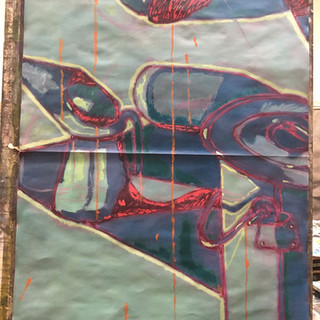
How it was last week: (desperately needing turquoise, I felt)
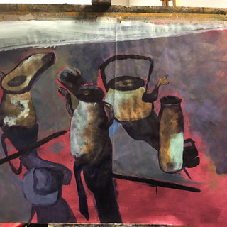
Had too much trouble mixing turquoise from the colours at my disposal, here is what it looked like half way through:
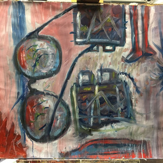
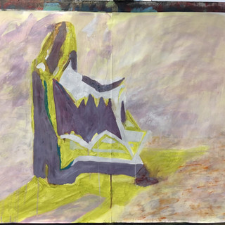
Here's the original drawing:
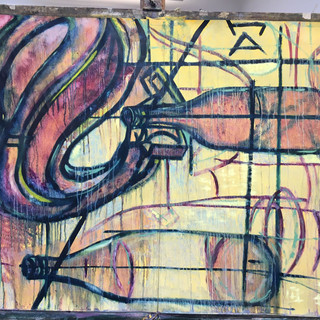
and here's the final.
This copying-your-drawing malarkey is quite an interesting way in to creating a painting that's a bit more interesting than just aspiring to create a 3d object in 2 d, and it's a great way of introducing your own colour palette that doesn't have to equate to real life. I'll have to find some time to have a few more gos on my own...


Comments